The Bed Bath and Beyond

Conduct a heuristic evaluation and competitive analysis on Bed Bath and Beyond website!
Project Overview
Bed Bath and Beyond’s mission is to make it easy to feel at home. What sets Bed Bath & Beyond apart from its peers is the sheer volume of options available to customers. These include a larger selection of brands, colors, styles, and textures.
Challenge
Use heuristic evaluation and competitive analysis to identify usability issues within the Bed Bath & Beyond website and shopping experience and create a detailed high-fidelity sketch of the redesign.
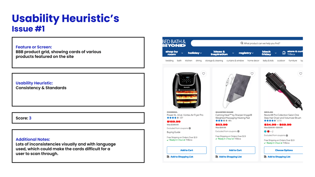
🔹Feature or Screen: BBB product grid, showing cards of various products featured on the site.
🔹Usability Heuristic: Consistency & Standards.
🔹Additional Notes: The product grid has many usability issues related to consistency and standards. The cards in the grid are inconsistent in terms of their visual appearance and the language used. This inconsistency could make the cards difficult for a user to scan through and understand.
Findings of Heuristic Evaluation
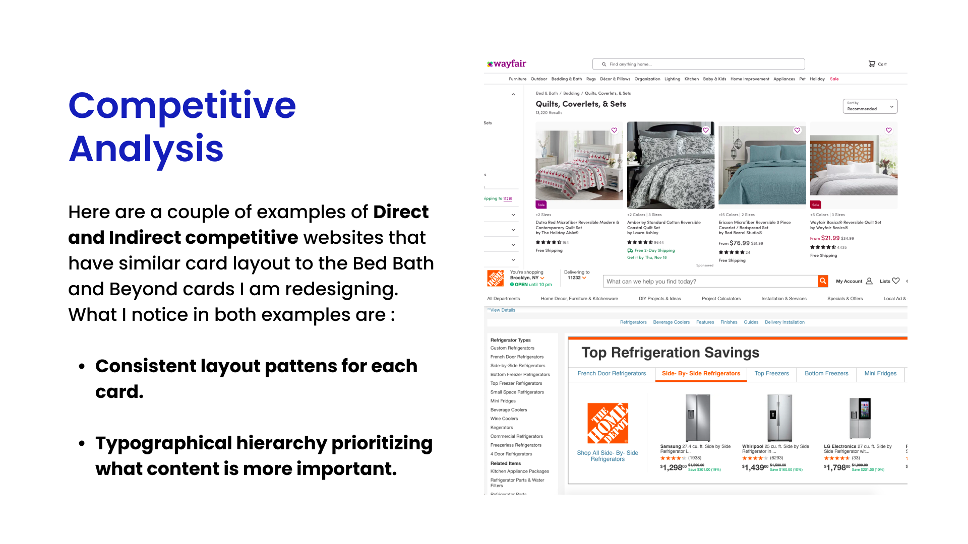
🔹Consistency and Hierarchy: Direct and indirect competitors use consistent layout patterns and typographical hierarchy in their product grids. These patterns make it easier for users to scan through the product grids and find the products they are looking for.
Findings of Competitive Analysis
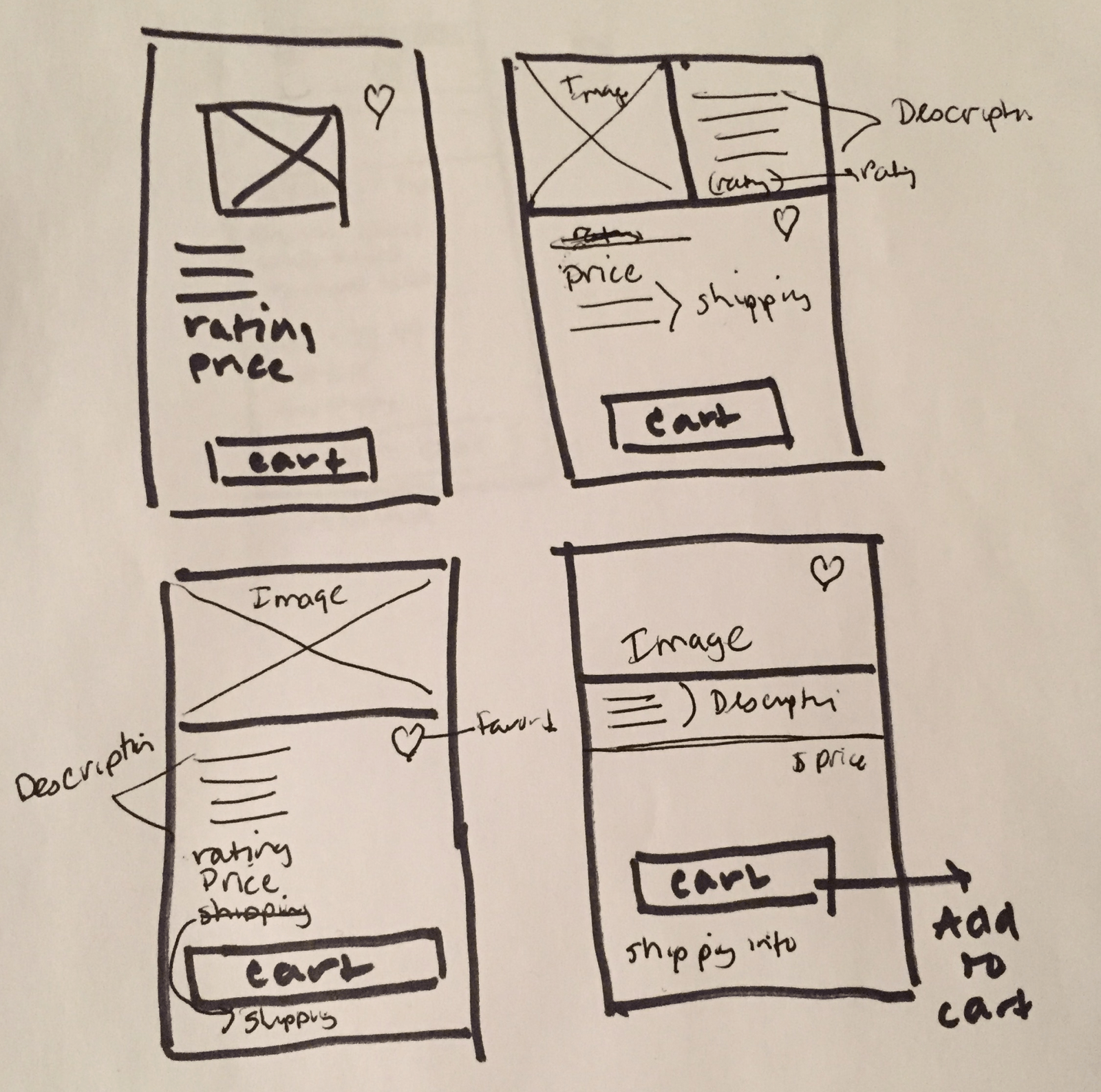
I sketched several new versions of the Bed Bath and Beyond product cards to show ways to improve some of the issues observed in the heuristic evaluation and the competitive analysis.

🔹I decided to start by focusing on the placement of the description of the product.
🔹This sketch shows a possible solution to solving the website hierarchy issues.
🔹I believe that this would improve the users experience because They would have a better idea of what content was more important.
Rapid Sketches and Prioritization
Detailed Sketch
I sketched several new versions of the Bed Bath and Beyond product cards to show ways to improve some of the issues observed in the heuristic evaluation and the competitive analysis.

🔹I decided to start by focusing on the placement of the description of the product.
🔹This sketch shows a possible solution to solving the website hierarchy issues.
🔹I believe that this would improve the users experience because They would have a better idea of what content was more important.
Hi-Fidelity Design
I sketched several new versions of the Bed Bath and Beyond product cards to show ways to improve some of the issues observed in the heuristic evaluation and the competitive analysis.

🔹I decided to start by focusing on the placement of the description of the product.
🔹This sketch shows a possible solution to solving the website hierarchy issues.
🔹I believe that this would improve the users experience because They would have a better idea of what content was more important.